Contao Image Alternatives
This extensions expands the capabilities of using responsive images with art direction in Contao. You will have the possibility to define a set of alternatives which will then allow you to define the respective alternatives per image in the file manager.
Suppose you want to use different images for a certain image size depending on the output device, i.e. a specific image for desktop, for tablets and for mobile. You can define a set of alternatives called mobile and tablet for example (desktop will be the fallback - the original image):
# config/config.yaml
contao_image_alternatives:
    alternatives:
        - tablet
        - mobile
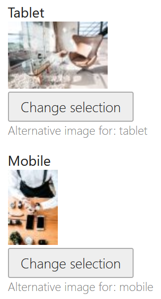
Now you can choose the alternatives for each image separately in Contao's file manager:
The back end labels for each alternative can be translated via the image_alternatives translation domain:
# translations/image_alternatives.en.yaml
tablet: Tablet
mobile: Mobile
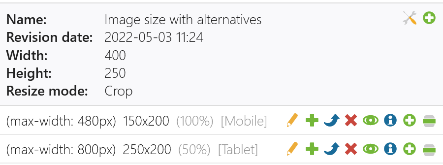
Within your image size settings you can then choose per media query item, whether an alternative image should be chosen for this particular image size:
Alternatively you can also set the alternative in your config via contao_image_alternatives.sizes.*.items. Note that the name of the size must be same name as in contao.image.sizes and the media query for each item must match with the ones in contao.image.sizes.*.items:
# config/config.yaml
contao_image_alternatives:
    alternatives:
        - tablet
        - mobile
    sizes:
        example:
            items:
                -
                    media: '(max-width: 480px)'
                    alternative: mobile
                -
                    media: '(max-width: 800px)'
                    alternative: tablet
When you choose the configured image size in your content element or module, the generated images will automatically use the alternative versions for each source image for the particular image size media query item.


